Color Meanings: Why it matters for Web Design and Branding
Color plays an important part in our everyday life, affecting our interactions with the world around us, including how we interact with brands. I know what you're thinking. Is color that important? Sure, we all have a favorite color, but it's not like the colors in my logo or on my website really affect my sales, right? According to Brand Minds, "Research shows that the proper use of color increases brand recognition by 80%. It also raises the visual appearance by 93%. A further 85% of consumers buy because of color."
https://brandminds.live/color-psychology-in-marketing-and-its-importance-in-driving-sales
Colors are one tool in your tool kit to create an emotional response in your customers. Colors linked with culture produce emotional ties. As you are setting out on this journey, it is important to remember that color meanings and responses are linked directly to culture. You should confirm their meaning to ensure you are sending the right message to your clientele.
According to Psychology Today, "Most people believe that the choices they make result from a rational analysis of available alternatives. In reality, however, emotions greatly influence and, in many cases, even determine our decisions."
 The Meanings behind colors
Color Psychology is the study of colors and how they relate to human behavior. Understanding the meaning of colors can give you an edge in your branding and marketing. There are no hard and fast meanings for each color. Meanings change with culture and from person to person. But some commonalities appear within cultures on the way we view color. Below is a guide of positive and negative terms associated with commonly used colors. Please note that these meanings are common in the western world and that these colors can and do have different meanings in other cultures.
Red
Red is the boldest color! If you want to make a splash and get attention, red is the way to go. Nothing captures our attention like this magnetic color. Red is the color of strength, energy, and passion; it is also the color of warning and anger. A little bit goes a long way, but this color can have a bold effect on your designs.

| Positives | Negatives |
|---|---|
| Passion | Anger |
| Excitement | Danger |
| Importance | Aggression |
| Love | War |
| Desire/Hunger | Communism |
Blue
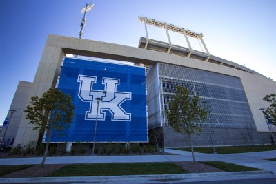
Blue is the color of reliability and trust. This color makes you relax and feel comfortable as if you are in good hands. Blue is a color with a wide range. Changing its shade and hue can give different feelings. If you want to show strength, professionalism, and honesty, lean towards a darker shade of blue. If you are wanting to be energizing, then a brighter blue is the way to go. Light blues lean towards calmness and relaxing feelings. Most importantly, if you're going to show that your company is a winner, there is no better color than Kentucky Wildcat Blue.
| Positives | Negatives |
|---|---|
| Confidence | Depression |
| Honesty | Coldness |
| Professionalism | Predictable |
| Relaxing | Conservative |
| Innocence | Passive |
| Tradition | Stuffiness |
Green
When we think about the color green, money is the first thing to mind for many of us. Green is connected to growth, prosperity, luck, and abundance. These feelings are all tied to how many of us, especially Americans, think about money. Green is a good choice for those companies with connections to finance, nature, and health.

| Positives | Negatives |
|---|---|
| Generosity | Envy |
| Renewal | Materialism |
| Luck | Inexperience |
| Stability | |
| Nature | |
| Growth |
Purple
It is ingrained in our culture that when we think of purple, we think of royalty. But did you know that if seen too much, it causes frustration? For design purposes, it is best to think of purple as an accent color.

| Positives | Negatives |
|---|---|
| Royalty | Frustration |
| Creativity | Immature |
| Wisdom | Anxiety |
| Luxury | Sadness |
Orange
I don't know about you, but when I think of orange, I think of fall leaves and Halloween, but this is not the only feeling orange generates. Orange is seen by many as the friendlier version of red. It is warm, inviting, capturing attention in a fun, creative way.

| Positives | Negatives |
|---|---|
| Creativity | Impatient |
| Energy | Domination |
| Humor | Warning |
Yellow
If yellow does not make you happy just by looking at it, then you might be a vampire. Yellow is the color of sunshine, hope, and optimism. It captures your attention, as we all know, i.e. the highlighter.

| Positives | Negatives |
|---|---|
| Happiness | Cowardness |
| Knowledge | Deception |
| Hope | Caution |
| Optimism | |
| Youth | |
| Logic |
Pink
Pink is a very loving color. We associate it with all the warm feelings that we have for other people. It is also commonly associated with youth. For years, it has been associated with girls, as blue has with boys, but we are evolving away from that thinking as a society.

| Positives | Negatives |
|---|---|
| Youth | Immature |
| Romance | Overly Emotional |
| Innocence | Timid |
Brown
Brown is a great color for those brands that have a connection to the earth. It is also a good choice for those that desire an old-fashioned feel. While it can be seen as predictable, it is good for brands to showcase their dependability.

| Positives | Negatives |
|---|---|
| Dependable | Boring |
| Old Fashioned | Old Fashioned |
| Support | Predictable |
| Wisdom | Dull |
Gray
Grey is the most neutral color. It does not bring up many feelings for people, and as such is has a safe feel to it. The last thing you want to do is drive people away with colors that upset them. Sadly, as a neutral color, it can be seen as rather dull.

| Positives | Negatives |
|---|---|
| Classic | Boring |
| Mature | Unemotional |
| Neutral | Sad |
Black
Black is one of the best colors in design; used for fonts, it presents a clean, easy-to-read format. As an accent color, it is bold and has an elegant sophistication. Depending on how you use this color, you can create an exciting modern feel for your company.
| Positives | Negatives |
|---|---|
| Sophistication | Dominance |
| Elegance | Formality |
| Mystery | Death |
| Strength | Mourning |
White
Love or hate seems to be the consensus with the color of white. For some, it is seen as the personification of cleanliness, innocence, and perfection. For others, it is boring, cold, and sterile.
| Positives | Negatives |
|---|---|
| Cleanliness | Cold |
| Innocence | Sterile |
| Openness | Distant |
| Goodness | Boring |
Colors in Branding
Don't let yourself get caught up in the idea that there is a right or wrong way to pick your brand's colors. Some designers suggest one color, others three. In the end, you need to pick out what works best for who your company is.
Please take a look at our brand colors.

You can see that we chose three colors, Green, Orange and Blue. Let us break those colors down. We chose a light and bright green, as a more brilliant green, it is more energizing than standard green but still speaks to growth and generosity, two very important traits in our company personality. The Orange is a bright orange, as it is not dark, it does not bring the fall feeling that would be adverse of growth that we are showing with the green. The Orange in our brand speaks to the creativity and humor of our staff.
Growth and creativity are two very important traits for success in the digital marketing landscape. Lastly, we use Blue. Unlike Green and Orange, Blue is not featured in our logo.

Blue is our accent color and sometimes functions as a neutral color for our company. While not in our logo, blue was not chosen at random. It speaks to several important qualities in our company, including confidence, honesty, and professionalism. Plus, it is pretty relaxing to work with our team.
Before jumping in and picking the colors that you like best:
- Take a moment to think about who your company is.
- Define your personality, and then choose colors that showcase those traits.
- Don't be afraid to be bold and play with brightness and hues.
Conclusion
"When it comes to picking the right color, research found that producing consumer reaction to color appropriateness in relation to the products is more important than the individual color itself," according to Brand Minds. Take your time to find the right colors that truly speak to your brand’s values and personality. Be sure that colors are right for your brand, as they will be the base around which all your marketing efforts will grow.
Here it is! You have been expecting it- the sales pitch. As I am sure you have discovered this blog is created by Lionzone Digital Marketing, which means that we would be more than happy to assist your company with their digital marketing needs; for more information about our services, please see lionzone.com . My favorite feature of our services, no long-term contracts! If we don't earn your business every day, we don't deserve to keep you!
More resources on Color Meanings:
https://www.color-meanings.com/
http://www.arttherapyblog.com/online/color-meanings-symbolism/#.YRvD1YhKjct


