Why is Visual Hierarchy important to your website design?

It is so easy to think of your website as a technical item and not put much thought into design beyond a cursory “how does it look.” But web design is not just about how a website looks! It is also how it makes your audience FEEL and how it encourages them to ACT. When done correctly, the design can excite you about a product and lead you to conversion. If you are not putting time and attention into your website's design, you are leaving money on the table. In times like these, every cent you can put back into your business is important. Visual Hierarchy is an important toolset to ensure that your website creates the right atmosphere to sell your products to the world.
What is Visual Hierarchy
Visual Hierarchy is a theory that describes how humans process information. It is a way of understanding how colors, shapes, sizes, and proportions affect how we digest information and how the lack of thoughtful design can leave viewers confused and overwhelmed.
Visual Hierarchy has its foundations in "Gestalt Psychology," developed in 1912 by three German psychologists. Gestalt Psychology seeks to better understand how humans perceive their world. Their work has evolved into understanding how humans interact with information in all its current forms.
https://www.britannica.com/science/Gestalt-psychology
Elements of Visual Hierarchy
The goal of Visual Hierarchy is to organize information to show the items of importance clearly. There are several elements that play a role in how our eyes determine significance:
Reading patterns
Two major reading patterns affect how people skim content: the F- pattern and the Z-pattern. I know what you're thinking: “I don't want people to scan my pages; I want them to read them!” The sad fact is that today, the human attention span is roughly 8 seconds. Our world has conditioned us to skim and not read, so reading patterns are vital in design.
The Z-pattern is how our brains focus attention in limited text situations. As the name suggests, our minds will read the top of the page and then drop their gaze to the left bottom corner and again read along the bottom line.
As you can see here with the Danny Flowers website, the design elements follow the Z pattern, directing the visitors' gaze to the important features of the home page.

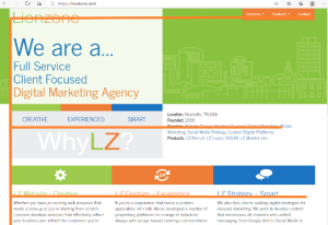
The F-pattern is used by our brains when the text is heavier. While the name implies that we skim in an F's shape, it is a little more complicated than that. Our brains scan for important keywords on the left side of the page, once located, read across the line to the right, and then start the process again.
In the Lionzone website, you can see that we make use of the F-pattern. As the goal of our home page is to deliver more information than what is needed in the Danny Flower’s site, the F-pattern is better suited to those goals.

Size
Bigger is better, or at least more important for your business goals. Size is the most recognized element of Visual Hierarchy. The BIGGER an item is, the more IMPORTANT our brains assume it is. (See what we did there?) Therefore titles, headlines, and important keywords are almost always larger than the rest of the text.
Alignment
The key to alignment is that your brain knows where to go for the things that you need. For example, the login button is almost always found in the top right-hand corner of a website. You know that, and your eyes are almost instantly drawn to it. Site Menus are almost always in one of two places, along the top of the page or on the left side. These alignments, which are common across websites and design styles, help readers know where to find common features.
With the Prime Source Entertainment website, you can see that the site menu is located along the top, and the “Request Info” button is located where the eye is trained to find the login button to increase conversion.
Color and contrast
Color plays a key role in how we see and feel about everything. Colors themselves incite feelings and emotions in human beings. Just think about what seeing your favorite color does for you! To learn more about the importance of colors, contrasts, and meanings, you can go to our blog post, Color Meanings: Why it matters for Web Design and Branding.
Repetition
Our eyes tell us that things that look the same are parts of a whole. When items stick out, such as changing fonts, color, etc., our minds conclude that these items are different. What is important here is that even when standing out, the related elements should have a similar format so that not only will it grab our attention, but we know what course of action to take with the item. Take hyperlinks for example. These items stand out on any page, but hyperlinks look the same across the world. If you see a word in blue, hover over it and it becomes underlined; your mind knows you can click this text and it will link to another page. If hyperlinks were not standard in the way they looked, it would not be apparent to the reader that they could use this text as a button; instead, they would merely stand out but leave the reader confused as what to do next.
Whitespace
Whitespace is the blank area around your information, images, and links that allow the eye to locate these items easily. Whitespace does not have to be white; it needs to be neutral—a place for the eyes to rest for a moment while highlighting the presented information.
Style and composition
The composition of your page is as important for a web designer as it is for an artist. Finding the right arrangement to match your style is key. Are you more formal? Then symmetry in the composition will relate to that feeling. Want to create energy and interest? Then the Rule of Thirds can assist with that. Need to point to one thing? Then leading lines are a must. Use the composition of your website to create the feeling and attention you need to drive conversions.
Conclusion
Improper use of Visual Hierarchy can impede sales and conversions by not directing your clients through a set path that leads to your call to action. While it may seem easy to implement some of the Visual Hierarchy theories on your own, if not properly implemented with a full plan, this can often backfire, decreasing sales.
Making design a key element of your website is vital to producing leads. Don't leave your clients confused about what steps are needed to purchase your products and the value that your company offers. Ensure that your website design is easy to use, builds trust, and excites by utilizing the best design elements.
Here it is! You have been expecting it- the sales pitch. As I am sure you have discovered this blog is created by Lionzone Digital Marketing, which means that we would be more than happy to assist your company with their web design needs; for more information about our services, please see Custom Web Design-Programing Nashville|Lionzone. My favorite feature of our services, no long-term contracts! If we don't earn your business every day, we don't deserve to keep you!
Resources:
https://www.britannica.com/science/Gestalt-psychology
Color Meanings: Why it matters for Web Design and Branding (lionzone.com)


